INTRODUCTION
When beginning to address the concept of the quantified self for my project I looked back at the material aspects of my life that I tend to ruminate on the most. The end outcome came down to clothing. This is something that I focus on frequently when it comes to organization. In my everyday life I organize my clothes in segments according to season and time. When the weather changes winter articles get packed away in favor of lighter fabric garments. And when things start to feel too small or have been worn out over time I set them aside to either donate or dispose of. For this project however I have decided to focus my organization through a different lens. This time I wanted to shift my attention over to details I don’t usually account for. By doing this I will have data and visualizations that will help me decide what I already have and don’t need more of as well as help me be more aware of where my clothing is coming from and what style I tend to gravitate towards the most.
RESEARCH QUESTION
My research question was based around my extensive sweater collection (the article of clothing I wear the most) and centered around the aforementioned query’s I wished to interrogate. These are the specific questions I based my visualizations on.
1. What are the specific styles of the sweaters (Sherpa, collared, hoodie, zip up and graphic)
2. Where are the sweaters made?
3. Was the sweater purchased online, at a store or was it second hand?
These questions will hopefully help me create correlations to distinguish how I classify my sense of style.
AUDIENCE
Because I inserted my own self made data and subject into this project the primary audience is me. However I feel that my data may also be of interest to those that are fascinated by visualizations utilizing the quantified self. Perhaps those that are also looking to organize their sweater/clothing collection may get inspired by the infographics.
DATA USED
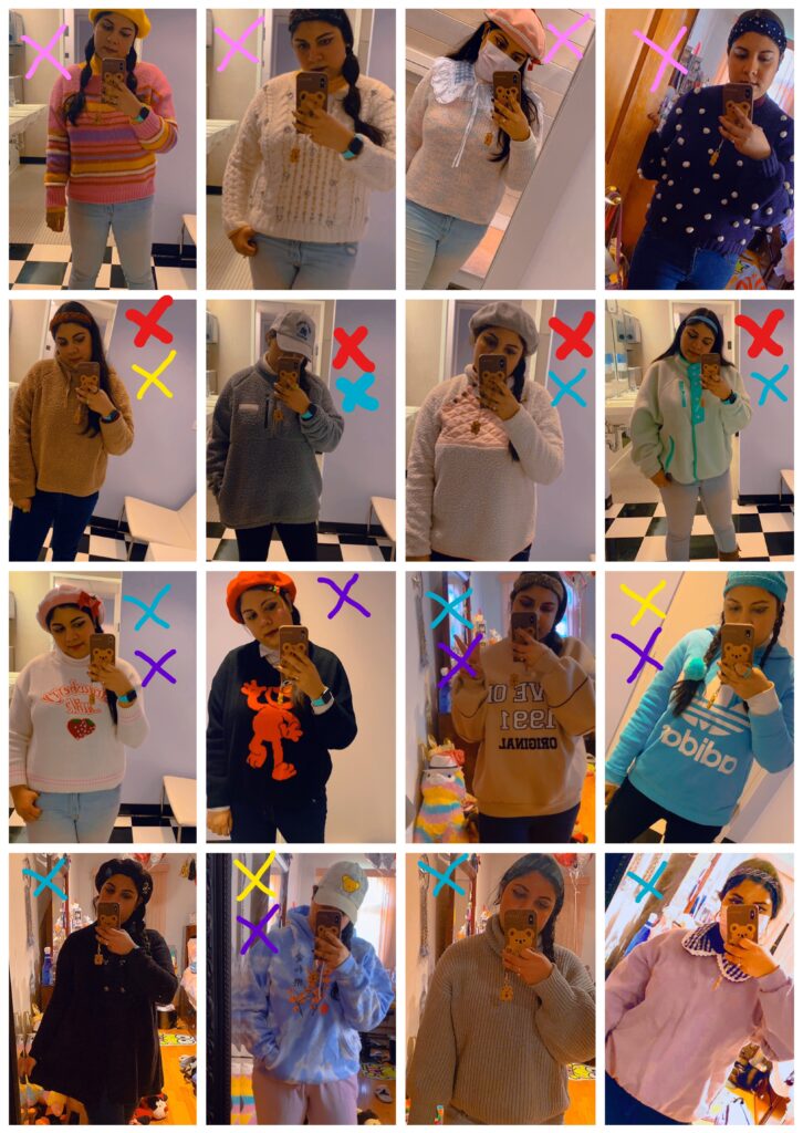
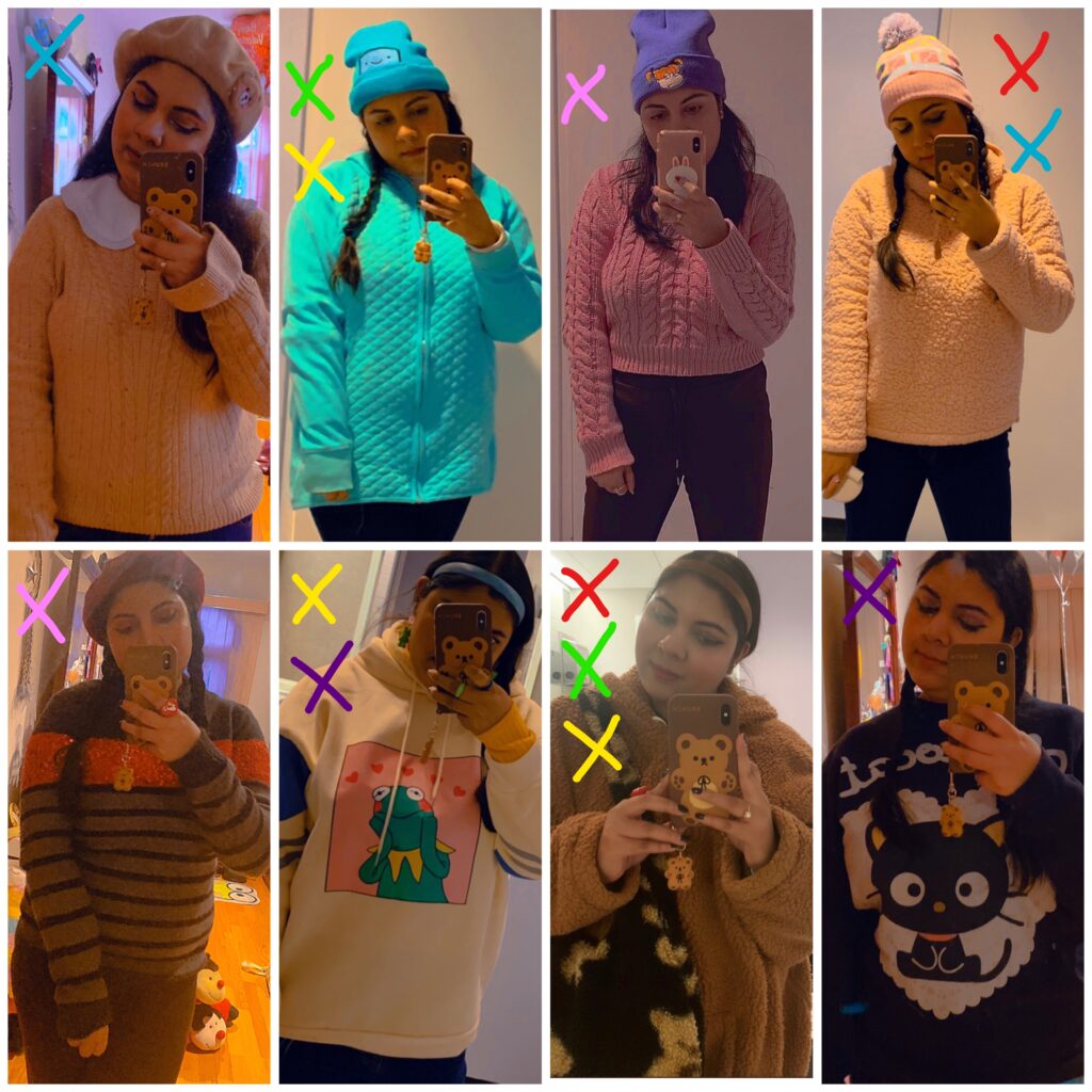
My data consisted of me wearing a different sweater each day for 24 days. This is the number that I deemed to be sufficient enough for multiple visualizations. Each day I took a picture to help me remember what specific sweaters have been worn. Once I had all 24 pictures I made 2 set collages. Using photo edit pens in different colors I took note of the particulars I wished to investigate in accordance to sweater type. For country the garment was made and details of whereabouts, I made a list on my notes app featuring both. The data collected then went into different excel sheets that was then imported into Tableau as separate files. I felt that this was the easiest way to go about this as filtering different data ended up confusing the system and quite frankly me. Below are the photo collages I made. (Color Key for Sweater Type Red-Sherpa, Blue-Collared, Yellow-Hoodie, Green- Zip Up, Purple-Graphic, Pink-Other or None of the above)
VISUALIZATION 1 (BAR GRAPH/S)
Sweater Collection Bar Graph | Tableau Public (Link for Better View)
(Click on image to activate hover over feature)
https://public.tableau.com/app/profile/faihaa.khan/viz/SweatersPerDesignType/Dashboard1 (Updated chart)
My first visualization was the most simple and straightforward. Using the the colored x’s on my photo collages, I counted how many sweaters fit into each design type and created a bar chart. I felt like this was the best graph to showcase a solid number count of data. However because a single sweater fit into multiple categories my bar charts are non exclusive. This is another reason as to why I chose a bar graph. The sweaters can still be separated even though they’re being counted more than once. My first chart separates each category on the x -axis while the y-axis presents the number of sweaters that fit in to each descriptor. According to my results I seem to favor collared sweaters the most although this is the category that I accounted for the most since turtlenecks also technically count as a collar. Surprisingly graphic, hoodie , Sherpa and other all had the same value of 6. For my second bar chart I decided to separate categories into mixed descriptor values. These were decided upon how many of the most mixed combinations were apparent in my data. This was my attempt to break down my stats even further. Both of these graphs together brings me to the conclusion that collar has definitely been my go to choice concerning sweaters.
Limitations- The mixed results in my bar graph makes it a bit difficult to discern the sweaters separately. The viewer will not be able to tell which category each sweater belongs to unless they take a look at my data set. This could present a problem if someone is looking for precise results.
VISUALIZATION 2
My second vis displays data on the origin of my sweaters i.e. In store, Second hand & Online. For this information I felt a pie chart was the best option. In making this infographic I made a list of the sweaters that I have worn and noted the bracket they belong in. Once I’ve done that I hand counted the number of sweaters in each bracket and imported the information in Tableau. From there I changed the numeric value to percent of total. The use of a pie chart was inspired by the ring pie chart used in Pris Lam’s “My Netflix Binge Fest”, which I personally felt was a good way to visualize 3 separate groupings. I’m aware that pie charts aren’t always the best to showcase data but in this case I feel it work’s fairly well. Without having to count through all my sweaters again I can tell that most sweaters were purchased in store with a whopping 63%.
Limitations- My percentage totals are taken from the whole sum of 100. I’m wondering if these would of made more sense to the viewer if I had put a whole number value instead. The pie chart also restricts the amount of info I can display. Although I’m satisfied with the graph because it tells me exactly what I need to know, the general bareness of the visual is a bit off putting.
VISUALIZATION 3
Sweater Collection Map | Tableau Public (Link for better view)
(Click on image to activate hover over feature)
For my last visualization I decided to do a map to illustrate where my sweaters were made. Initially I wanted to do a dot density map separated by continents but my data quickly revealed that most of my sweaters were made in China. In order to avoid the cluttered image of multiple dots in one region, I decided to display the countries of origin separately and indicate the number of sweaters made in each country by size. Each country is also indicated by a different color and highlighted to make the points extra clear. The hover over feature shows the number of sweaters per country listed. Aside from various garments being made in China the size of the dots also exhibit that Pakistan and Honduras also have multiple sweaters.
Limitations- I personally feel maps are best used when there’s a large amount of data to work with. Quite a few of the countries on my map only feature one sweater. Perhaps if I had more sweaters for each this would be a more intriguing visual.
Next Steps
In all I feel like I went the simple route when it came to my graphs. This may not necessarily be a bad thing but if I were to continue with this quantified self visualization I would be a bit more nuanced with what I am trying to uncover in my data. Or I’d simply just expand on what I already have. Perhaps a stacked bar chart layered combining design type combinations and design type would of been more interesting or multiple pie charts comparing sweaters in each category in accordance to the details in my bar graph. One thing for certain is that I would definitely build on my data set. I have way more sweaters than I’m showing here so if I had the time I would of most definitely added more!